PROJECT OVERVIEW
Concept Development
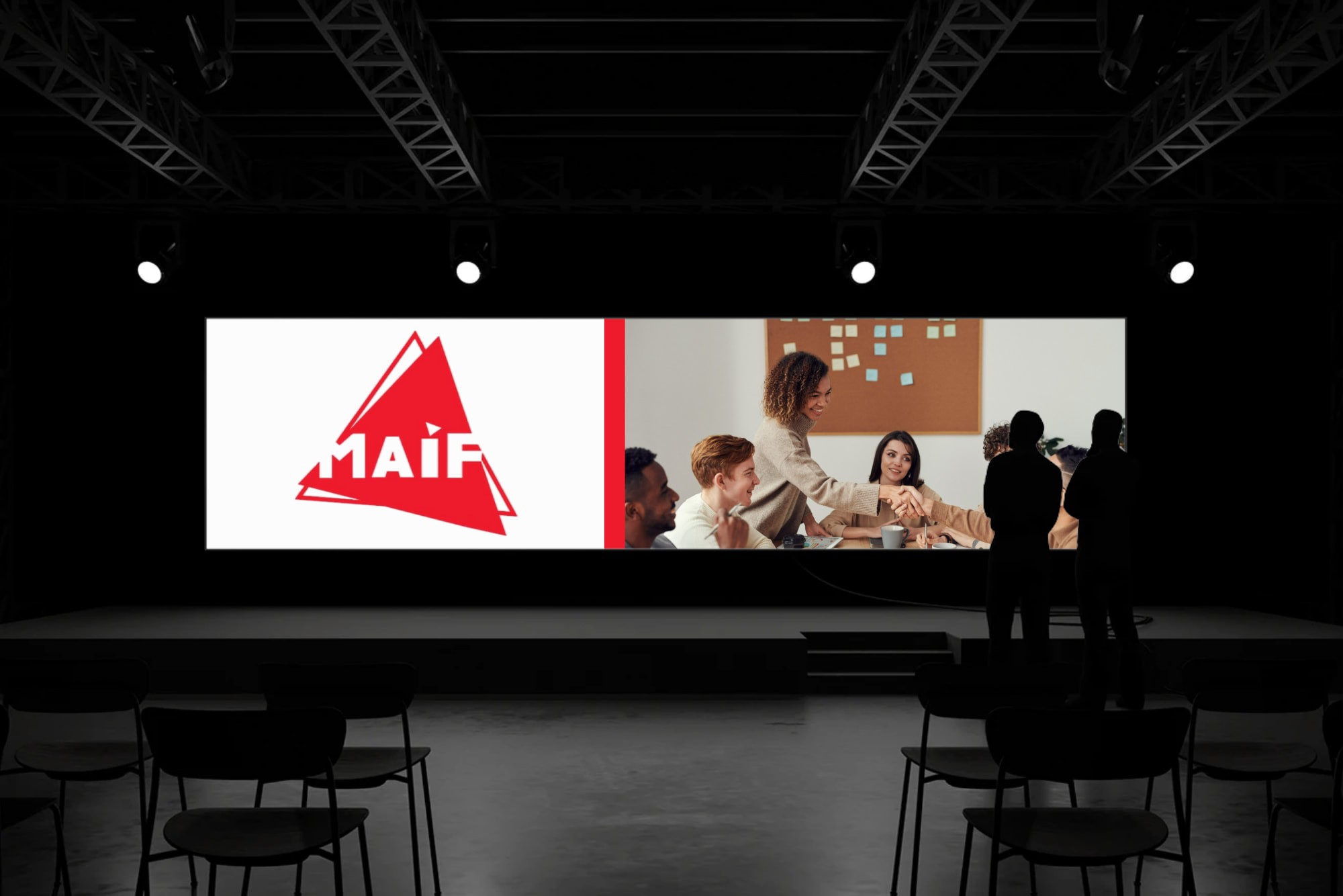
The MAIF Visual Identity Redesign focused on creating a modern and cohesive brand identity. This included a logo redesign, graphic charter, and applications across digital and print materials. The goal was to communicate trust, professionalism, and approachability.
The concept development phase emphasized clarity, elegance, and consistency. Colors, typography, and visual elements were carefully selected to make the brand identity modern and versatile.
Mood board Creation
The concept development phase centered on the triangle, a form symbolizing balance, stability, and protection. This geometric figure became the foundation for reimagining the MAIF identity, transforming the brand’s strength into a more dynamic and expressive visual language. By exploring variations of solid and outlined triangles, as well as fragmented and tilted compositions, we introduced movement and modernity while preserving the essence of trust and reliability. The use of bold red, paired with clean typography, reinforced energy, commitment, and impact, while sketch explorations captured the raw authenticity of the creative process. Together, these elements shaped a narrative of strength, clarity, and resilience, reflecting a brand deeply rooted in both tradition and forward-thinking innovation.

Final Result
Finally, the art direction was brought to life through a series of reinterpretations of the MAIF logo. The iconic triangle became the central motif, explored in both solid and outlined forms, as well as through dynamic variations that introduced movement and energy. Sketches translated into digital experiments, where typography was carefully integrated within the triangular structure, reinforcing a sense of unity between shape and wordmark.
Across applications, the visual language emphasized bold red tones, symbolizing strength and engagement, balanced by the clarity of geometric composition. This exploration reflects a thoughtful approach to brand transformation — one that respects the original identity while opening it to new creative possibilities. It demonstrates the power of visual storytelling through geometry, merging tradition and innovation into a cohesive design journey.
Category
"Visual Identity & Branding "Redesign of the MAIF logo and development of a cohesive brand system, including logo, colors, typography, and applications across digital & print.
Timeline
May 2024 - July 2024
Live Project
View Work
